Showing posts with label design. Show all posts

Tuesday, February 10, 2009

The Designers Republic Closes Down


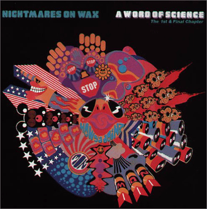
A design by The Designers Republic for A Word Of Science: The First And Final Chapter by Nightmares On Wax (Warp Records, 1991)

The Designers Republic, an influential and often imitated graphic design studio of Sheffield, England, has closed down in January. tDR was among all known for the record sleeve designs for Warp Records, also based in Sheffield, that were there to define the look for the early-1990s electronic music subculture. The tDR designs -- a treasure trove for anyone into visual semantics -- have been known for their bright colours, immersing in their stylistic characteristics among all Japanese manga/anime style, the 1920s Russian Constructivism, corporate logos (with a healthy amount of anti-consumerist irony) and a bit of cyberdelia.

  • The Designers Republic Remembered @ Creative Review blog

  • The Designers Republic search results @ YouTube
  • Friday, January 23, 2009

    S.H.I.E.L.D. Art by Steranko


    The very first issue of Nick Fury's own title with psychedelic lettering and patterns.


    The "S.H.I.E.L.D. Origin Issue", with some OP art designs.


    A striking science fiction cover; too bad the story inside was not by Steranko and had nothing to do with the sleeve art.


    A surrealist art-inspired cover also reminiscing the films of Alfred Hitchcock (who, in fact, collaborated with Salvador Dalí for Spellbound.)

    Through Facebook, I recently got hooked up again with Canadian Tony Robertson, who maintains an excellent tribute site to American comic book artist and illustrator Jim Steranko. As a fan of the artist's work, I used to host my own Steranko tribute under pHinnWeb during the late-90s, but eventually gave up the site (partly because of worrying about the copyright issues) and let Tony "adopt" for his own site the Steranko-related material I had gathered together so far (including the 1983 Amazing Heroes and 1989 Betty Pages feature stories on Steranko).

    James "Jim" Steranko (b. 1938), known in the industry only as Steranko, is best known for his take on the Marvel Comics character Nick Fury -- who started his life as a WWII hero Sgt. Fury, now promoted to the rank of Colonel as the head of a spy organization S.H.I.E.L.D., wearing a futuristic jumpsuit and also rejuvenated with a mystical youth serum -- which started in 1965 through Strange Tales magazine; the character receiving his own title, Nick Fury: Agent of S.H.I.E.L.D, in 1968. S.H.I.E.L.D. (Supreme Headquarters International Espionage Law-enforcement Division) was inspired by other fictional spy organizations like U.N.C.L.E. (of the TV show Man from U.N.C.L.E.), when Marvel Comics decided to jump in to the secret agent craze popular in the mid-60s after the phenomenal success of James Bond movies.

    For Nick Fury, Steranko developed a totally new flashy narrative style he called "Zap Art", based on the groundwork made by Marvel stalwart Jack Kirby and then further inspired by psychedelia, OP art and surrealism. Marvel Comics titles such as The Fantastic Four and Dr. Strange had already appealed to the hippie generation with their spectacular cosmic visions, and Steranko was consciously to apply to his own works the psychedelic visual style familiar from the rock posters and record covers of the era. Also Will Eisner's Spirit and Eisner's cinematic photomontage-like style of "consequential art" informed Steranko; furthermore, the influence of classic comic book illustrators like Hal Foster of Prince Valiant (large splash pages with long descriptive text captions) and Russ Manning's (Tarzan and Magnus, Robot Fighter) fantasy landscapes were there, also Wally Wood's striking style Wood used in his horror and sci-fi comics. As a writer Steranko ofter favoured elliptical narratives with theatrical pulp fiction style drawing inspiration from hard-boiled crime fiction, sci-fi and even Gothic horror style.

    Steranko, who also had worked as a stage magician, was fascinated by all sorts of games and complicated labyrinth designs, so Nick Fury was seen adventuring in several intricate (and psychedelic) mazes the arch-villains like Hydra had set up for him. The dialogue, with Nick Fury's hard-nut war veteran/bar brawl "Brooklynese", with tough-guy expressions like "flapping one's gums" (= talking too much), sounds now often comically corny and contrived, but hey, isn't that the case, too, when reading also other Marvel titles of the era? Anyway, Steranko might be remembered as a great "postmodern" synthesist, who combined different existing styles to create his own visual narrative (and in his turn influenced other artists like French Philippe Druillet, who took Steranko's psychedelic OP art style and used it for his own byzanthine Lone Sloane in the 70s).

    Steranko's hectic working schedule for Marvel took its toll and he finally left the company in 1969. After that he worked briefly for some horror and romance comics titles of other publishers, before establishing his own Supergraphics company, which published two volumes of The Steranko History of Comics in 1970 and 1972, also the magazine Comixscene, which then evolved into Mediascene and finally Prevue, lasting until 1994.

    Steranko also provided illustrations for several pulp novels, some comics books and pin-ups. Chandler: Red Tide was a 1976 film noir-inspired "graphic novel" entirely created by Steranko. 1981 saw the comic book adaptation of Outland, a Peter Hyams sci-fi thriller based on the classic Western High Noon and apparently influenced by the bleak-corporate-future visual style of Ridley Scott's Alien. Steranko's Outland was serialised in the legendary Heavy Metal magazine.

    Steranko also worked as a conceptual artist for the films Raiders of the Lost Ark (1981) and Bram Stoker's Dracula by Francis Ford Coppola (1992). Marvel's attempts to lure Steranko back creating Nick Fury comics were unsuccessful, though he did create some revived S.H.I.E.L.D. title mini-series cover illustrations. These days Steranko is considered an elder statesman of comic book art, still doing occasional cover art and more "femme fatale" pin-ups.
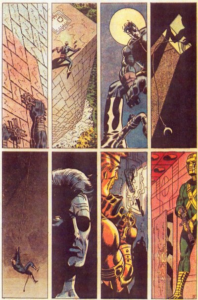


    For more on Steranko, check both Wikipedia and Tony's site for countless examples of Steranko's art.


    The uncensored illustration of Nick Fury's girlfriend Countess Valentina. Marvel Comics, in their infinite wisdom, blackened out in the published version the curvy details of La Contessa's buttocks, perhaps thinking they would be too much for the imaginations of the boy readers who had just entered their puberty...
    Monday, December 01, 2008

    Fashion Photographer Max Petrelius (1940 - 2008)


    Finnish fashion and commercial photographer Max Petrelius died on 16 November 2008. Petrelius, who might have been called "Finland's David Bailey", had been born on 5 May 1940. He studied in 1958 - 60 under Rolf Winquist in Stockholm.

    During his study trips to France in 1960 - 62 he got acquainted with the work of local commercial and fashion photographers. He had his own studio in Helsinki from 1960 to 1987, where several future fashion photographers learned their trade. As a highly sought-after fashion photographer Max Petrelius gained somewhat a star status in the 1960s Finland, with fashion companies, magazines and advertising agencies all competing to use his works.

    He collaborated with acclaimed fashion designer Vuokko Nurmesniemi [more] from 1964 onwards, and the photographs by Petrelius of Nurmesniemi's designs found their way to many international fashion and art publications. Also Artek was one those countless Finnish companies using Petrelius's services.

    In 1969 Petrelius, as a first fashion photographer ever, was granted Finnish State Prize for Photography and in 2000 State Artist Pension.

    More photos by Max Petrelius:

  • Villayhtymä, 1960s
  • Pyörre dress by Vuokko Nurmesniemi, 1966
  • Suunta dress by Nurmesniemi, 1973
  • Aida dress designed by Nurmesniemi, 1982

  • Vuokko by Vuokko Nurmesniemi
  • Friday, November 30, 2007

    Eero Aarnio Annoyed By Piratism


    Finnish designer Eero Aarnio (b. 1932) recently got annoyed in Berlin when a TV interview with him was arranged to a car retail store. To his horror, Aarnio found out the store's two Ball Chairs (also known as Globe Chairs) -- his most famous design -- that were planned to be used as backdrop for the interview were actually copies. Aarnio says there are numerous pirate copies of his globe chair manufactured around the world, but it's nearly useless to sue the manufacturers because of the varying global copyright laws, which Aarnio thinks often leave the rights of the original designer nearly non-existent. Ball Chair was created by Eero Aarnio in 1966 and it (or its copies) has been featured in several movies, music videos, countless fashion shoots and so on: basically whenever a piece of stylish retro design is required.

    The retrospective exhibition of Eero Aarnio's works "Retropop, Phantasie und Tagträume" is now on display at the Finnish Embassy in Berlin from November 8, 2007 to January 4, 2008.

  • Related news in Finnish @ MTV3
  • A Futuro House Sold in Paris for 140,000 Euros


    Futuro video clip 1


    Futuro 2

    On Tuesday 27 November 2007, one of the remaining Futuro houses was sold at Christie's auction in Paris for 140,000 euros. Futuro was a flying saucer-shaped fibreglass house designed by Finnish architect Matti Suuronen in 1968, reflecting the era's futuristic space age dreams. Futuro was the subject of Mika Taanila's 1998 documentary film Futuro - A New Stance for Future and also appeared on Jimi Tenor's video The Year of the Apocalypse.

  • Related news @ YLE
  • Monday, September 24, 2007

    Barney Bubbles


    {feuilleton} also features an excellent article on the innovative British visual designer Barney Bubbles, real name Colin Fulcher (1942-1983). Mostly famously, Barney Bubbles was responsible for Hawkwind's psychedelic-science-fiction-Hell's-Angels-meet-Russian-Constructivism designs, but also for some new wave artists like Elvis Costello and Ian Dury. He also contributed to the UK underground magazines such as Oz, IT and Friends/Frendz.

    http://www.johncoulthart.com/feuilleton/?p=1296

  • Barney Bubbles 1983 obituary @ NME, as republished by Aural Innovations
  • Reasons To Be Cheerful: The Life & Work of Barney Bubbles by Paul Gorman (a book, published November 2008, UK, ISBN: 978-0-9552017-3-8)
  • John Coulthart on Reasons To Be Cheerful
  • Saturday, December 16, 2006

    Archigram vs. Brutalist Modernism


    Modernism prevailed in architecture since the post-First World War era, in the visions of such people as Le Corbusier, Bauhaus and Functionalists; and by the 1960s this ascetic approach had developed into the minimalist, massive and menacing -- at its worst even post-Stalinist totalitarian -- style of the slabs of concrete, in what was called "Brutalist architecture". Combined with the technocratic city-planning, often manipulated by greedy and corrupt real estate deals, this was the style that prevailed all over the world, as the architecture of earlier eras was often ruthlessly erased and demolished to give way to the box-shaped steel and concrete office buildings and suburban apartment houses of element blocks. (My own hometown Tampere can well be called another example here, when several "wars" were waged over in the 60s and 70s to save such idyllic late 19th century/early 20th buildings as the City Hall or the Old Market Hall, threatened by an impending demolition in the hands of technocratic City Fathers.)

    This autocratic dogmatism of Modernism/Brutalism was now challenged by architects who respected more the organic, evolutionary aspects of the city. Perhaps the most inventive and influential thinkers in this vein were the members of Archigram, a group of British architects that got together in the early 1960s through the Architectural Association in London; comprising Warren Chalk, Peter Cook (no relation to the era's famous British comedian of the same name), Dennis Crompton, David Green, Ron Herron and Michael Webb. Archigram's ideas were expressed in imaginative, often playful fantasy projects and colourful collages in "pop" spirit, which were published on the pages of their eponymous journal launched in 1961. Many of Archigram's designs were actually never meant to be realised as finished buildings, only as joyful simulations of what architecture could perhaps be in some possible but distant future, such as Roy Herron's "Walking City" of 1964: with an outlandish idea of a city that could be moved on its mechanical legs from one area to another!

    Archigram were influenced by science fiction, comic books and other popular culture, engineering, and generally taking ideas from outside their own medium to find new approaches for architecture. In Amazing Archigram 4 Zoom Issue of 1964 Warren Chalk wrote: "In this second half of the twentieth century, the old idols are crumbling, the old precepts strangely irrelevant, the old dogmas no longer valid. We are in pursuit of an idea, a new vernacular, something alongside the space capsules, computers, and throw-away packages of an atomic and electronic age".

    Bibliography:
  • Peter Cook (ed.): Archigram (Princeton Architectural Press, 1999, ISBN 1568981945)
  • Simon Sadler: Archigram: Architecture without Architecture (The MIT Press, 2005, ISBN 0262693224)


    click for larger image


  • Archigram Image Search @ Google
  • Archigram Gallery
  • Archigram @ DesignMuseum.org
  • Archigram @ The Bartlett: Architecture
  • Archigram @ Art Tower Mito
  • Archigram @ Wikipedia
  •